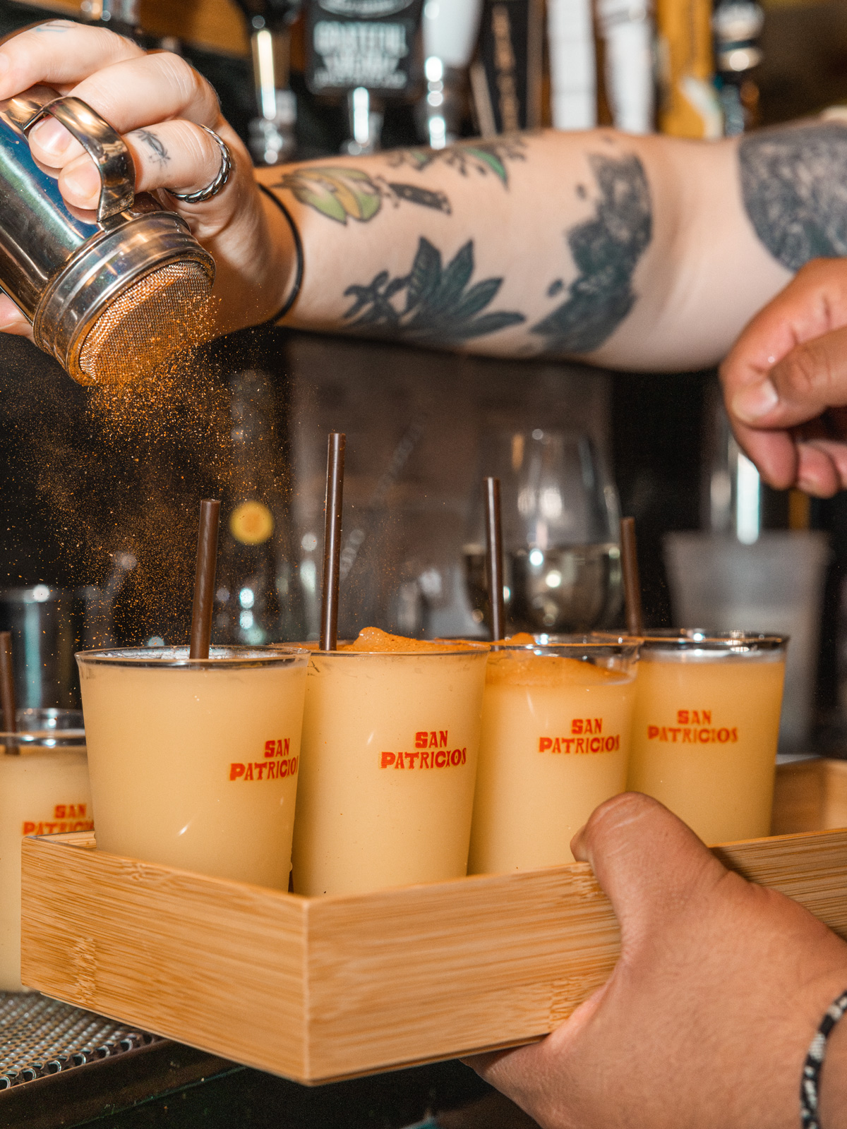
San Patricios
.jpg)
This one could’ve gone very wrong, very quickly.
When The Dead Rabbit came to us with a concept blending Irish and Mexican culture, there was a fine line between something interesting and something a bit try-hard.
So we kept coming back to the same idea - it just needed to feel real.
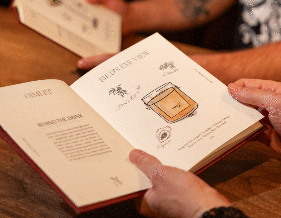
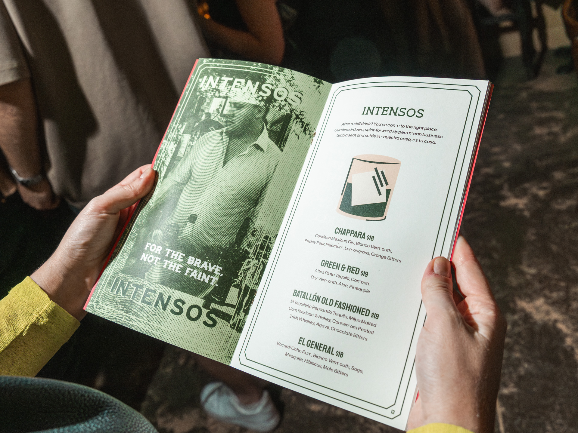
San Patricios takes its name from the battalion of Irish soldiers who fought for Mexico in the 1800s. It’s a great story, but we didn’t want to turn it into a history lesson. We took the parts that felt relevant - loyalty, rebellion, people finding common ground and built from there.
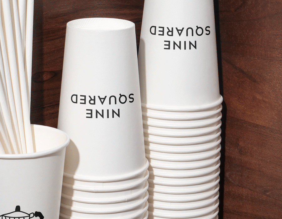
The identity ended up feeling quite loose and instinctive. The logotype shifts and stretches, each letter distinct, pulling from Irish and Mexican signage rather than one fixed style. Not perfect, but full of character.
Illustration does a lot of the heavy lifting. Florian built out this whole world that feels a bit folkloric, a bit rough around the edges, but still modern.
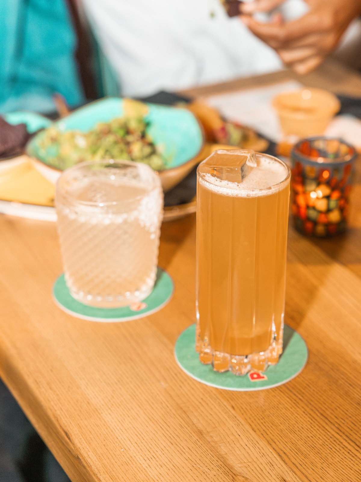
The space itself leans into that same mix - part Irish pub, part Mexican cantina. Worn wood, murals, colour, noise… it’s busy in a good way. And that was kind of the goal. Not something overly designed, just something people actually want to spend time in.
First round's a Guinness, second round's a margarita.
- Photography + Video Drink In Creative
- Copywriting Lower Case Socials
- Illustration Florian Schommer
.jpg)

.jpg)


.jpg)
.jpg)

( work )