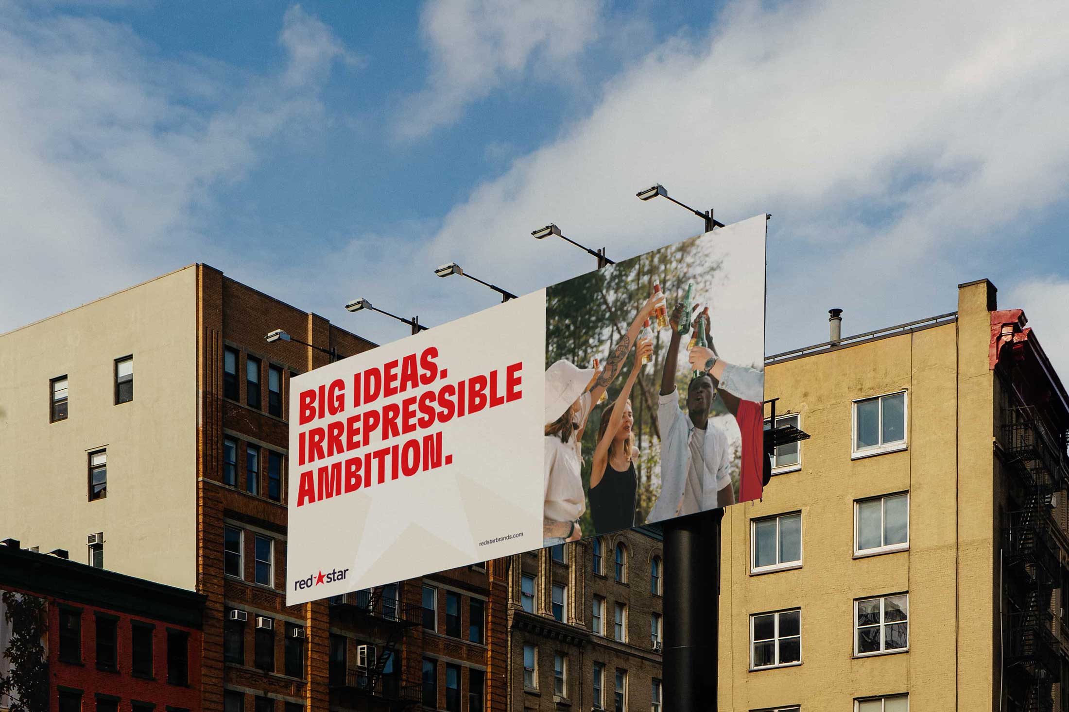
Redstar Brands
Redstar came to us after ten years of building a solid reputation distributing some of the most interesting brands in the space. The foundations were there, it just didn’t quite reflect where they were heading.
So the job wasn’t to rip it up and start again. It was more about tightening things, giving it a bit more confidence.
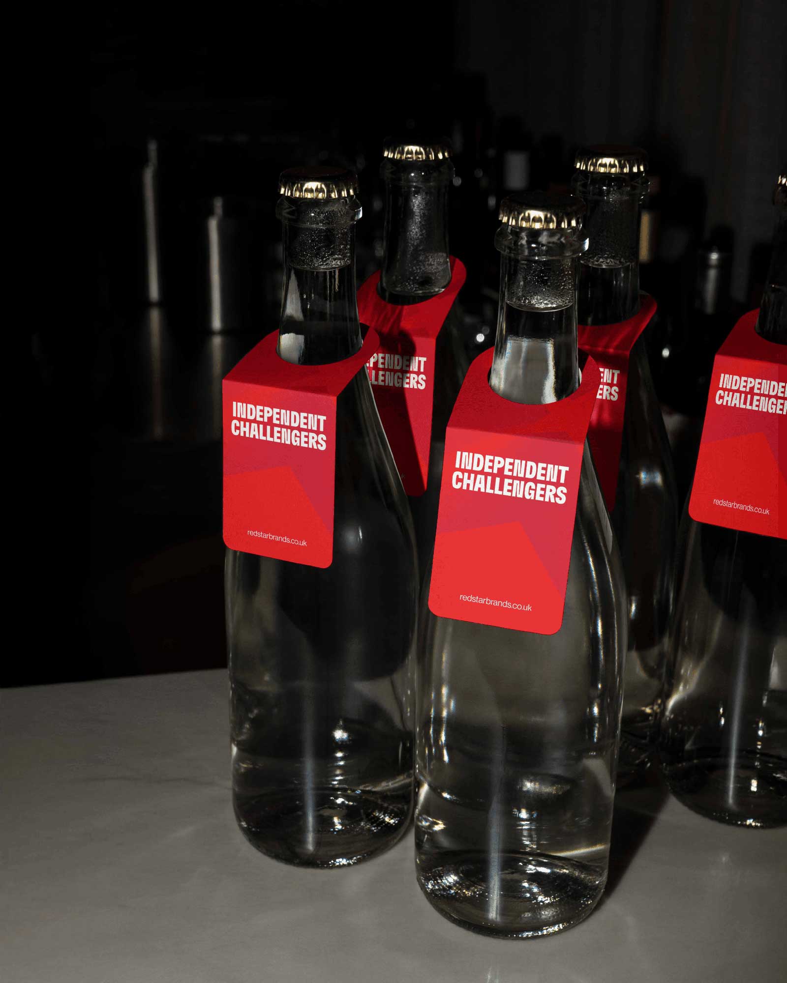
We kept what mattered and pushed everything else forward. The colour palette opened up, the typography got sharper, and the system overall just had a bit more presence.
The star became the anchor. It was always there, just not really doing much. We brought it forward and let it lead, turning it into something that could flex across the brand rather than just sit in the logo.
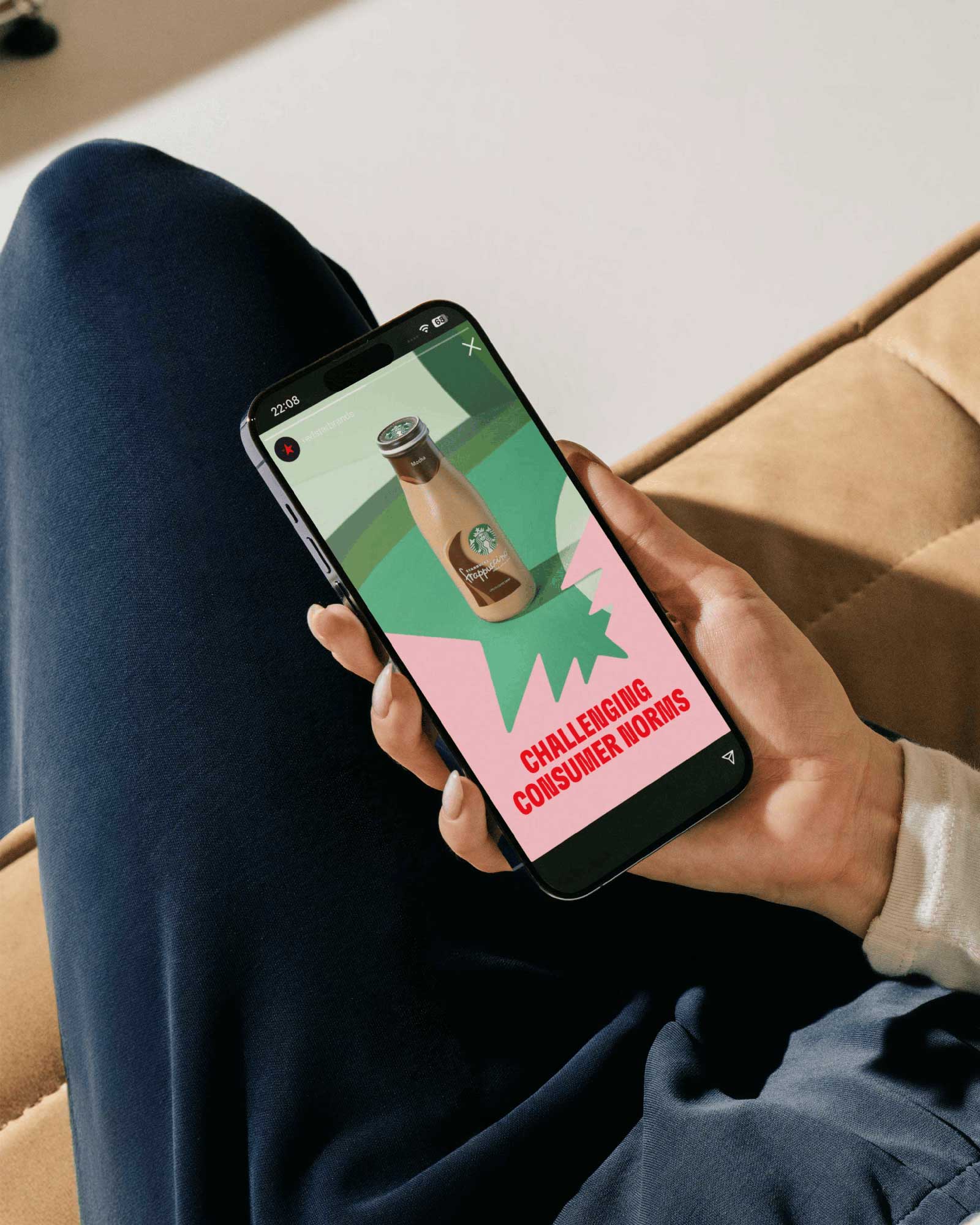
Motion played a big part too. It added a bit of energy and helped everything feel more current, especially across digital.
Nothing crazy, just a series of small shifts that add up.
Feels more like where they are now.


( work )