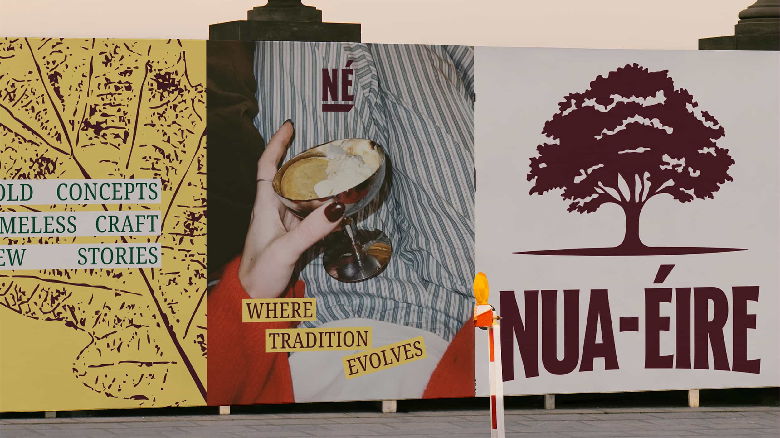
NUA-ÉIRE
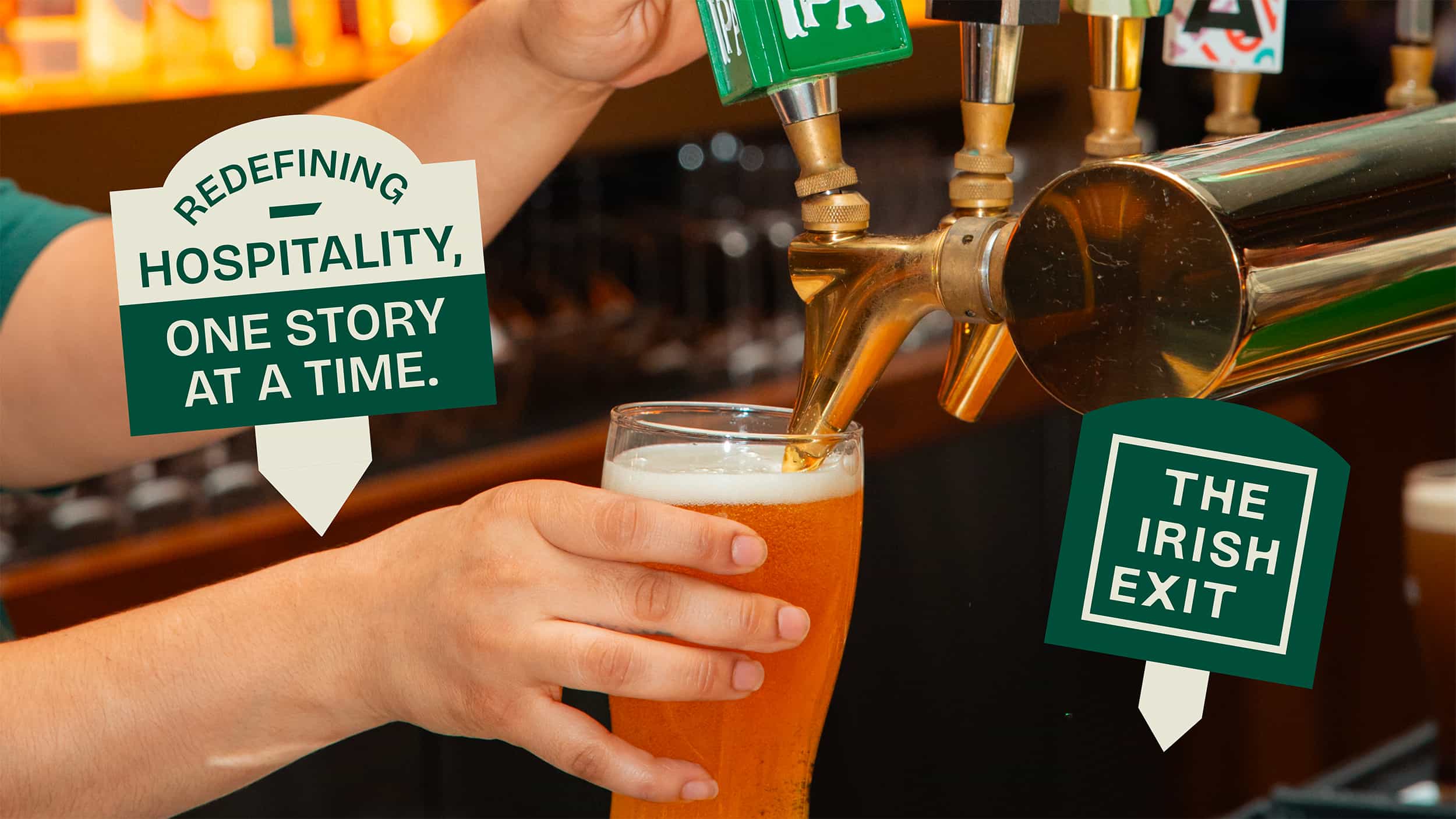
Nua-Éire isn’t just a brand, it’s something Jack’s building out properly. A way to shape and launch hospitality concepts that are rooted in Irish culture, but don’t feel stuck in it.
The challenge was getting that balance right. It needed to feel authentic, but not nostalgic. Something that could grow over time without needing to be reinvented every couple of years.
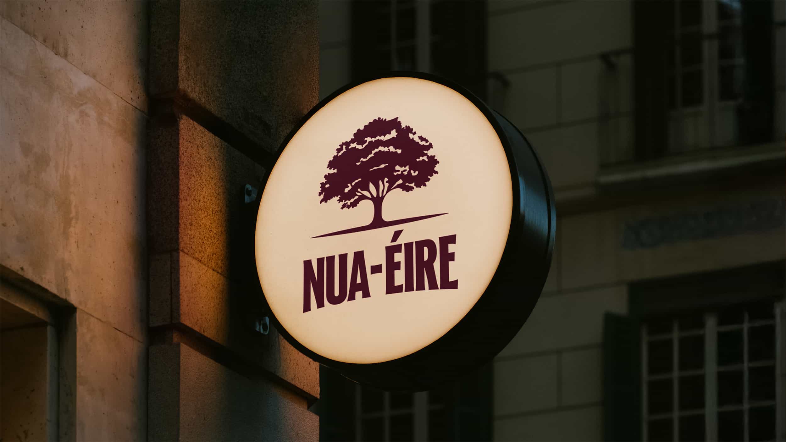
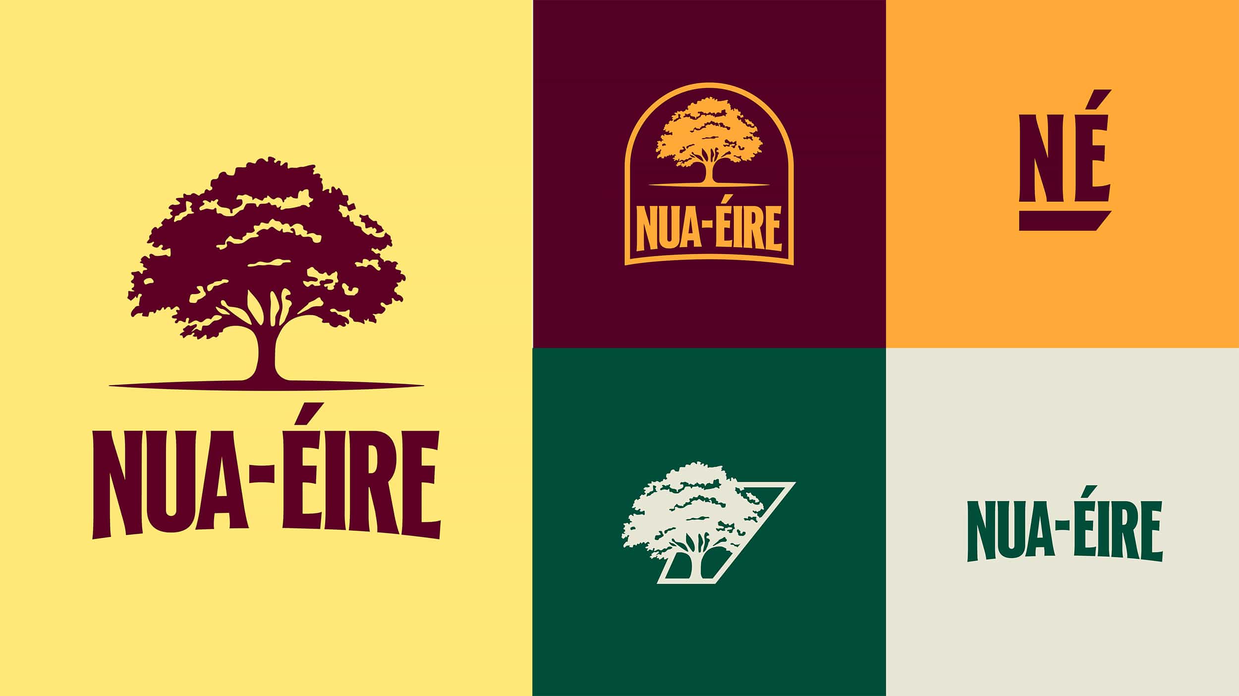
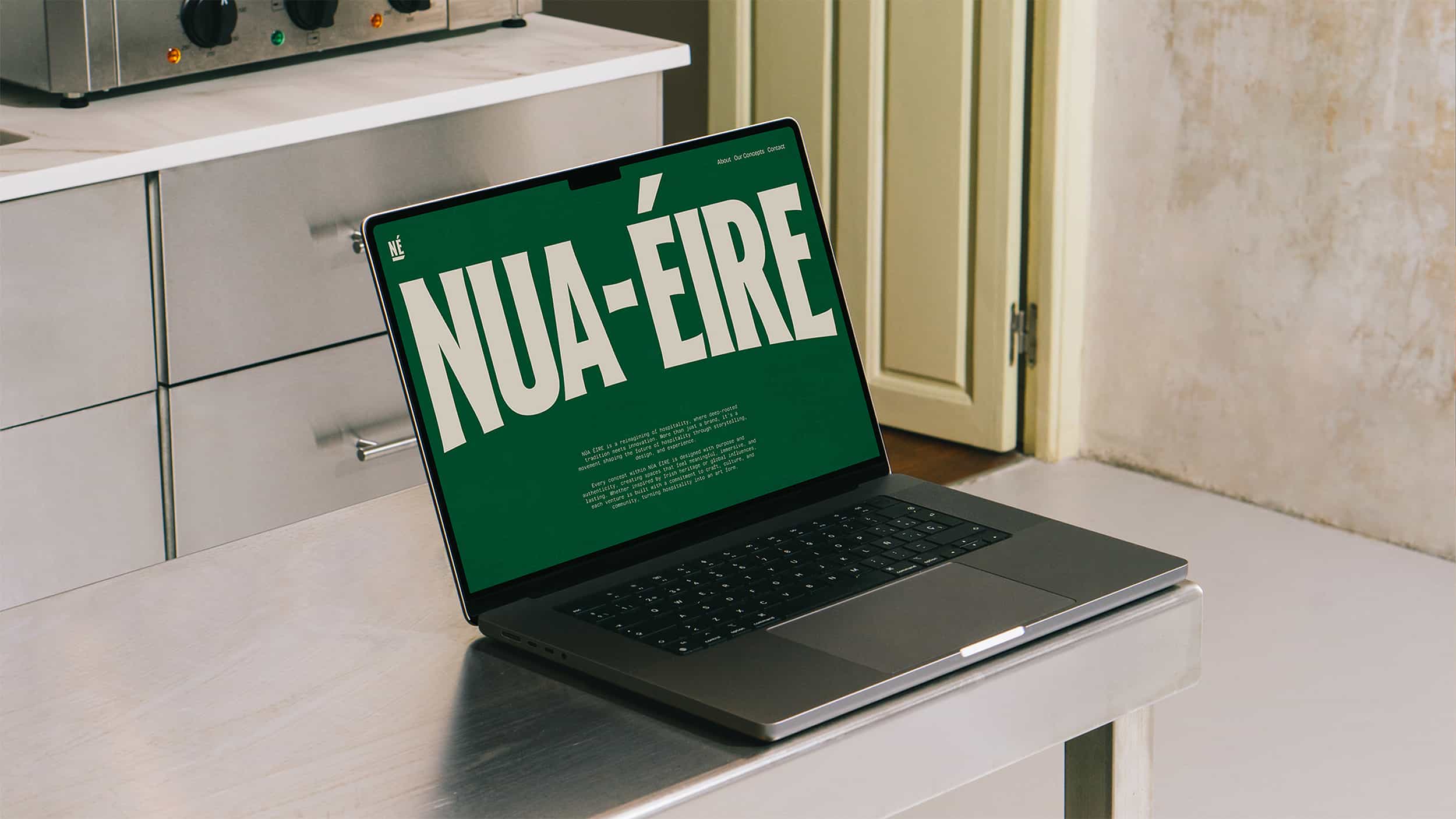
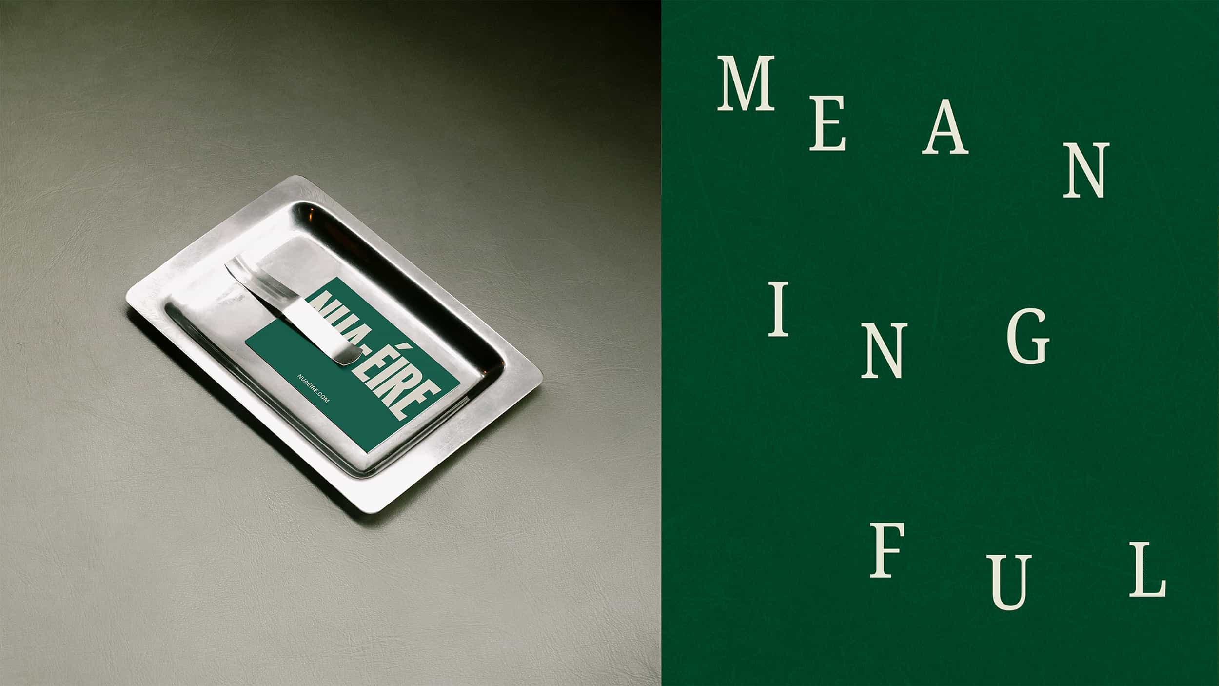
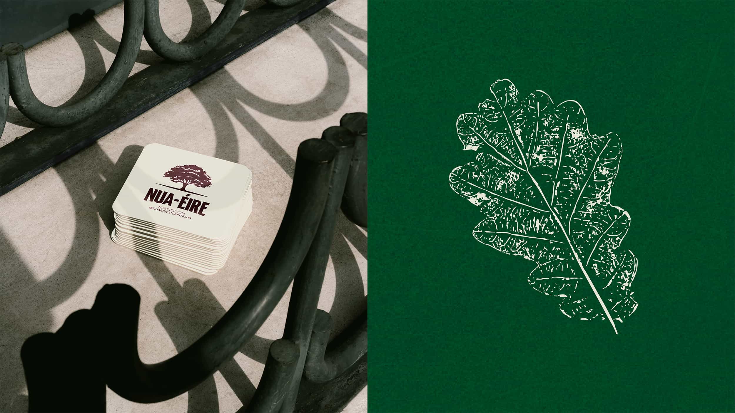
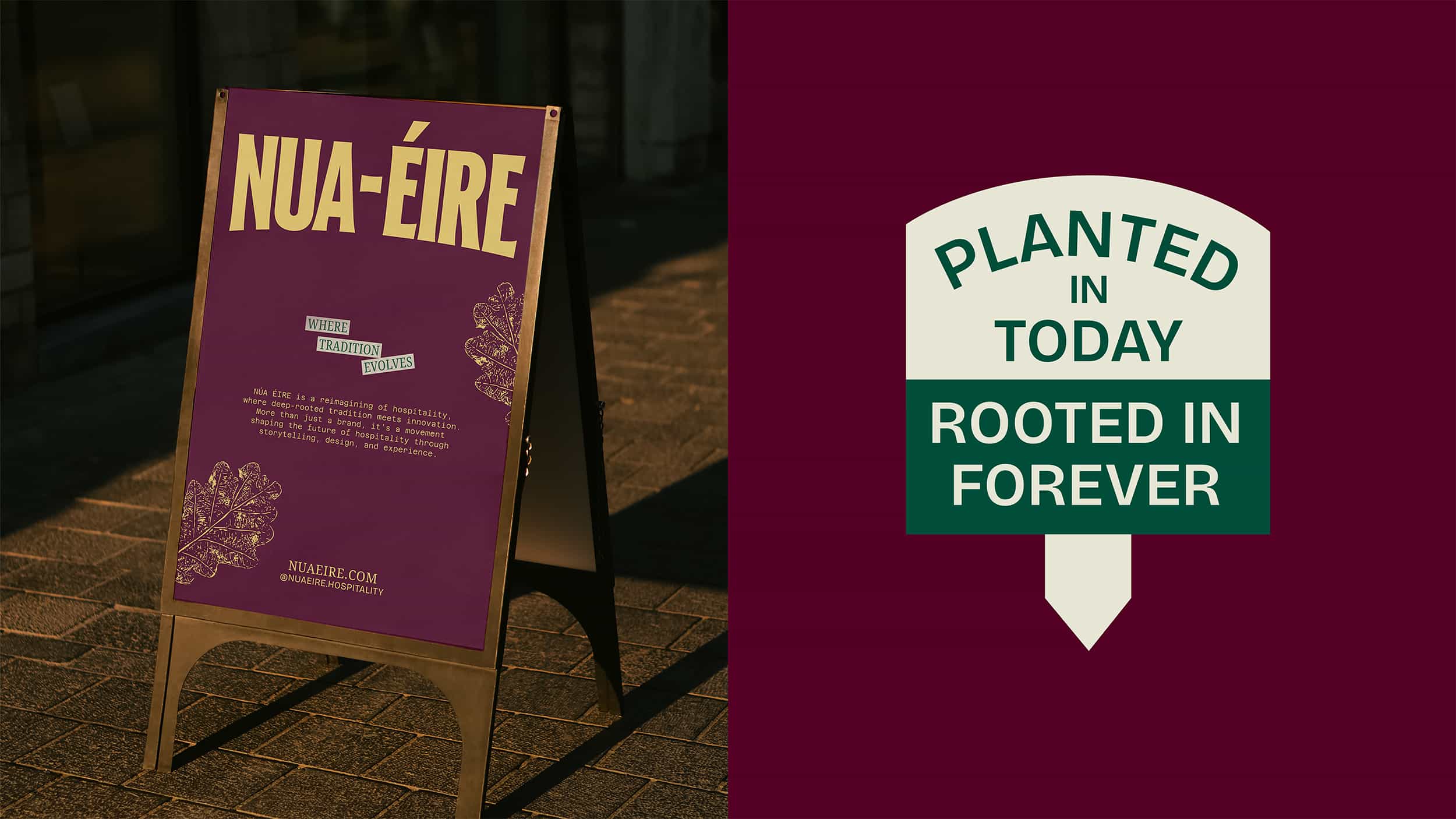
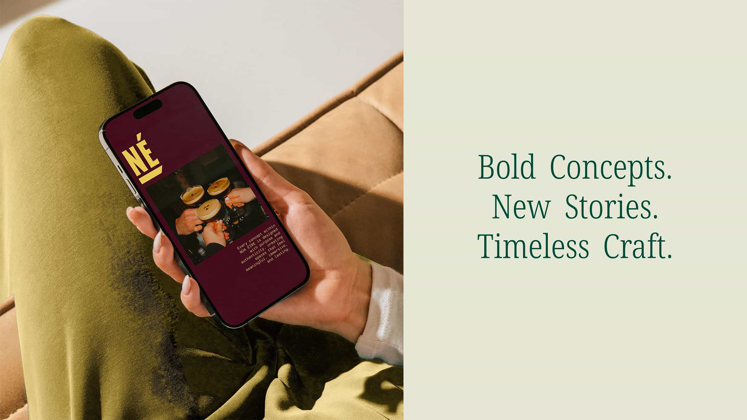
We started with a hand-drawn logotype. Nothing too polished, just something with a bit of weight to it, but still soft enough to feel human. From there, we built out a flexible type system and a palette pulled from the Irish landscape - colours that feel familiar without being too on the nose.
The oak leaves became a bit of a favourite. Each one hand-printed, all slightly different. It felt like a nice way of saying the same thing - no two experiences are the same, but they all come from the same place.
There’s also a quieter layer to it, pulling from plant cards and ideas around nurture and growth. Not something you notice straight away, but it gives the whole thing a bit of depth.
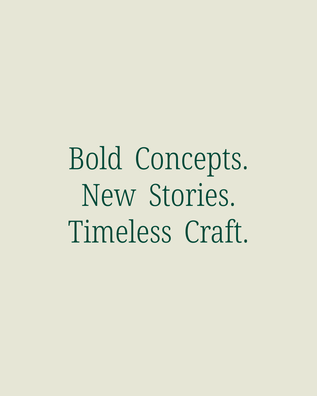
It’s less about a finished brand, more about something that can keep evolving.
Which felt right for what it is.
Also, the studio’s first ever paid project. One we’ll always remember.


( work )